The other day I had reason to think about what actually comprises a typesetting stack. Typesetting allows the documents you compiled to be read on a output medium. For this post I’ll focus on screen-output.
Other have tried to give a systematic overview of what typesetting is. Nevertheless, I’ll jot down my own attempt, focussing on UAX, i.e. the Unicode recommendations and algorithms for various aspects of text segmentation.
A Walk through the Layout Process
It’s clear that the rules of various Unicode annexes play an important role during typsetting. But how and at what stages do they fit in?
Let’s first sketch out a high-level overview of the typesetting flow. As we’re mainly interested in UAX rules, and the domain of UAX is a paragraph, we focus on layout of a single paragraph. We start with text input. It is common practice to use UPPERCASE letters to denote right-to-left context, e.g. Hebrew or Arabic writing.

Authoring
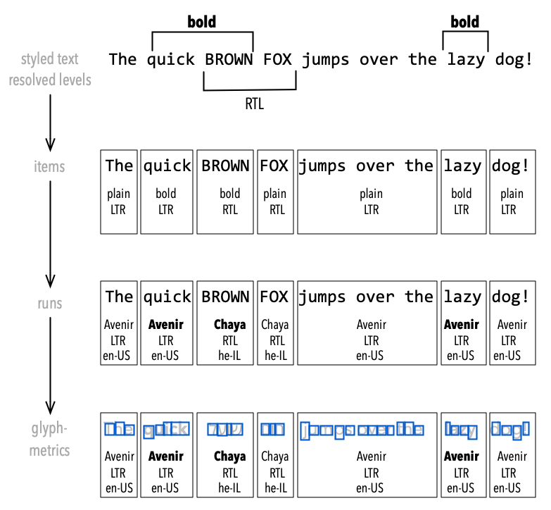
Authoring creates text and inserts markup to style the text: some words or sentences may be marked as ‘bold’ or ‘italics,’ or fragments of text may get colored. Some authoring systems allow styling to be done in WYSIWYG-mode with out-of-band markup (MS-Word), other use in-band markup (HTML, Markdown). Whatever the system, the styling information has to be attached as attributes onto the raw text.
Now the layer of Lettering starts. This marks the transition from attributed runs of text to sequences of glyphs. First the attributed text is analyzed: directional runs, language and script. This is where UAX comes into play.

Lettering
The UAX#9 bidi algorithm determines the directionality for bidirectional Unicode text. It obtains the correct display ordering from the logical ordering of characters. The algorithm is not perfect for every script and language, but a useful starting point, and authors may support the algorithm by inserting markers called ‘explicit directional isolates.’
Overlaying style information and bidi information results in splitting the text into items, i.e. sequences of characters with equal attributes. These attributes can now be mapped to fonts, resulting in character runs each having a font selected for them. This font is able to express the visual attributes of the run. The glyph metric information of a font is taken by a shaper to assemble glyph sequences, where all the rules for selecting glyphs and their positioning relative to each other are considered. Often this selection and positioning process is script- and language-dependent, including the directional context.
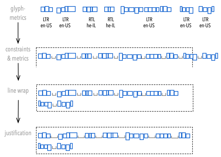
At the Lettering stage, glyph outlines are still irrelevant. We are purely concerned with the metrics of a glyph. This continues into the Line Breaking layer, where the layout engine tries to fit sequences of glyphs into a paragraph box.

Line Breaking
Line-breaking may become very complex if unusual typography is involved (mathematical formulae, chemical symbols, IP-adresses, etc.), but let’s ignore this for now. Also, let’s ignore the possibility of non-rectengular paragraph frames.
Older typesetting systems (e.g. TeX) treat whitespace special by substituting the whitespace-glyph by a flexible unit of space. This approach works for Western scripts, but for international text there are cases where this will fail. In those cases the space may be required for shaping. In terms of Unicode, UAX#14 (line wrap) and UAX#29 (entities of text) and UAX#51 (emojis) are good candidates to support splitting the glyph-sequence into segments.
UAX rules operate on characters, requiring the typesetter to maintain a correlation between the raw text and the glyph-sequences produced by the shaper. Shapers like Harfbuzz support this by providing cluster links. In fact, there are several szenarios during line-breaking where the shaper will have to be consulted again. This may even become a major performance concern for some applications, e.g. GUIs.
Interaction of Components for Line-Breaking
If you’re still with me at this point you are probably prepared to dive even deeper. Let’s first consider the easier case: treating whitespace special, like TeX and many other layout engines do. My view is that this is a reasonable “fast path,” working in many scenarios for many scripts, and that typesetters in general should cover this approach.
Not all whitespace is created equal, and UAX#29 (section “Word boundaries”) should help segmenting on spaces. The UAX#29 standard comments:
Word boundaries are related to line boundaries, but are distinct: there are some word boundaries that are not line boundaries, and vice versa. A line boundary is usually a word boundary, but there are exceptions […]
Note that breaking on whitespace works for many right-to-left contexts as well. How the spaces at the boundaries between LTR and RTL are treated is defined in UAX#9, and the typesetter has to respect the re-ordered resolved levels of the bidi algorithm.
Strategies for Line-Breaking
The big advantage of the breaking-on-whitespace approach is, that the shaper can be called for segments of text (“words”) one after another, and shaped segments are independent of each other as far as the shaper is concerned. Harfbuzz will even help typesetters by returning a “unsafe-to-break” marker, where unsafe means: needs re-shaping in case of breaking here.
Different strategies exist for detecting feasible break-points, one of them being the ‘naive’ algorithm of breaking as soon as the next segment does not fit a line (“first fit” algorithm). Smarter algorithms optimize less short-sighted by finding a global optimum of some loss-function over the whole paragraph (e.g., Knuth & Plass or Android’s Minikin). K&P finds and juggles more feasible break-points, possibly requiring more shaper-calls. However, caching shaper results will almost certainly be part of any layout engine, and the general case of line-breaking discussed below puts an even heavier load on the shaper-interaction. (Images below taken from Bram Stein’s typeset project page.)

Browser vs K&P Line-Breaking
Scripts like Thai do not usually break on whitespace, but rather within words between syllables. Recognizing syllables is a task neither the shaper nor a Unicode Annex will help us with. But there are other cases, too, where calling the shaper with fragments of text and then re-assembling the shaped fragments with separating whitespace is not a valid option. For the general case incrementally growing prefixes of lines have to be subjected to the shaper. These calls necessarily include fragments of a line already shaped in the previous call, possibly resulting in a lot of redundancy. K&P would need even (logarithmically) more shaping calls. In terms of Unicode rules, UAX#14 (line wrap) will support the typesetter in the general case.
Hyphenation
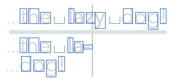
For some languages (like German), hyphenation is a must for good typographic results. Finding hyphenation opportunities may be done by Liang’s algorithm or by dictionary, but independent of the method used, a larger number of feasible break-points for line-breaking will be found than without hyphenation. However, having to insert a hyphen will require to re-consult the shaper for (at least) the broken word, this time calling it for each half of the broken word.

Hyphenating la-zy
Let’s consider the case from above, but this time our typesetter will decide to break the line by hyphenating the word “lazy.” Prefix “la-” will be shaped and measured. If it fits on the line, breaking at the hyphen may be regarding feasible by the line-breaker (possibly depending on other visual constraints). As hyphenation slows down line-breaking, some typesetters first try laying out a paragraph without considering hyphenation, and if this cannot pass a certain qualitiy criteria, run a second pass with hyphens enabled.
Re-assembling Fragments to Lines
After the typsetter has decided on the final break-points, the fragments found during line-breaking have to be re-assembled to produce a box for each line. If the layout requires justifying the paragraph left and right, lines not containing enough material to naturally fill the line will have to be expanded in some way. For Western languages, whitespace is the obvious candidate for expansion, but other options exist as well.
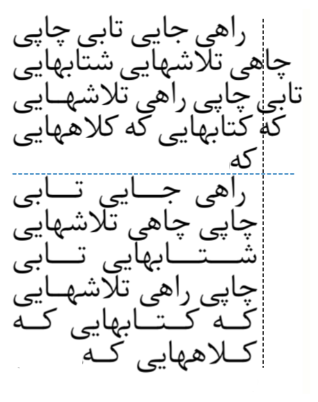
Of special interest is Arabic script, where it’s rather uncommon to strech whitespace. Rather a feature called “kashida” is applied (image taken from this stackexchange discussion).

Kashida
With Kashida, letter connectors are elongated to fill excessive space. It has to be supported by the font in use, which must contain glyphs to do the stretching, and the shaper has to support it as well. In general, every line will have to be re-inspected by the shaper. For mixed LTR and RTL text, the typesetter has to decide on where the stretching goes.
Show me the final Output!
We covered a lot of ground, but even so had to disregard a lot of problems present in real-world typesetting: user-provided markup hints for formatting, vertical typesetting, ruby characters, mathematics, glyph alternatives in OpenType fonts, etc. But this has been a long read already, so we better stop and take a break.
I know you’re curious of how this all will end up as a fully typeset paragraph on a screen. However, this will be illustrated in a follow-up post, where we dive into the challenges of rasterization.
Happy typesetting!
